Our colour for this month is red. Dependant on the shade, red adds excitement, energy and warmth to a room scheme. Dining rooms lend themselves perfectly to red, as do small cosy snugs and grand spaces accentuated with open fires and candlelight. This colour has signified luxury over the years and creates a superb backdrop for entertaining and socialising.
Red brings vitality to interior spaces and is a bold statement colour that draws the eye. It is also a perfect accent colour for an existing scheme. Adding a rug, throw or some cushions in a strong, bright red such as an eye-catching crimson offers an effective way to enrich and enliven your room.
Paints
There is a vast array of red shades available with cool and warm tones. These include raspberry, ruby, crimson, claret and flame. When choosing a paint shade, consider the lighting and existing furnishings in the room.
Sanderson Paints
Our Sanderson paint collection includes the dramatic Bengal Red, a deep colour with a touch of black adding an air of luxury to a room (image 1). Other red shades in the Sanderson palette include Amanpuri Red, a rich ruby shade used to add warmth and depth (image 2) and Carmen Light, a silky soft shade with a slight pink tone (image 3).


Zoffany Paints
Zoffany Paints include the eye-catching Crimson, Shaker Red, a timeless deep red with a hint of purple, and the classic colour of Bordeaux, a velvety rich, dramatic colour adding depth to any room.
Little Greene Paints
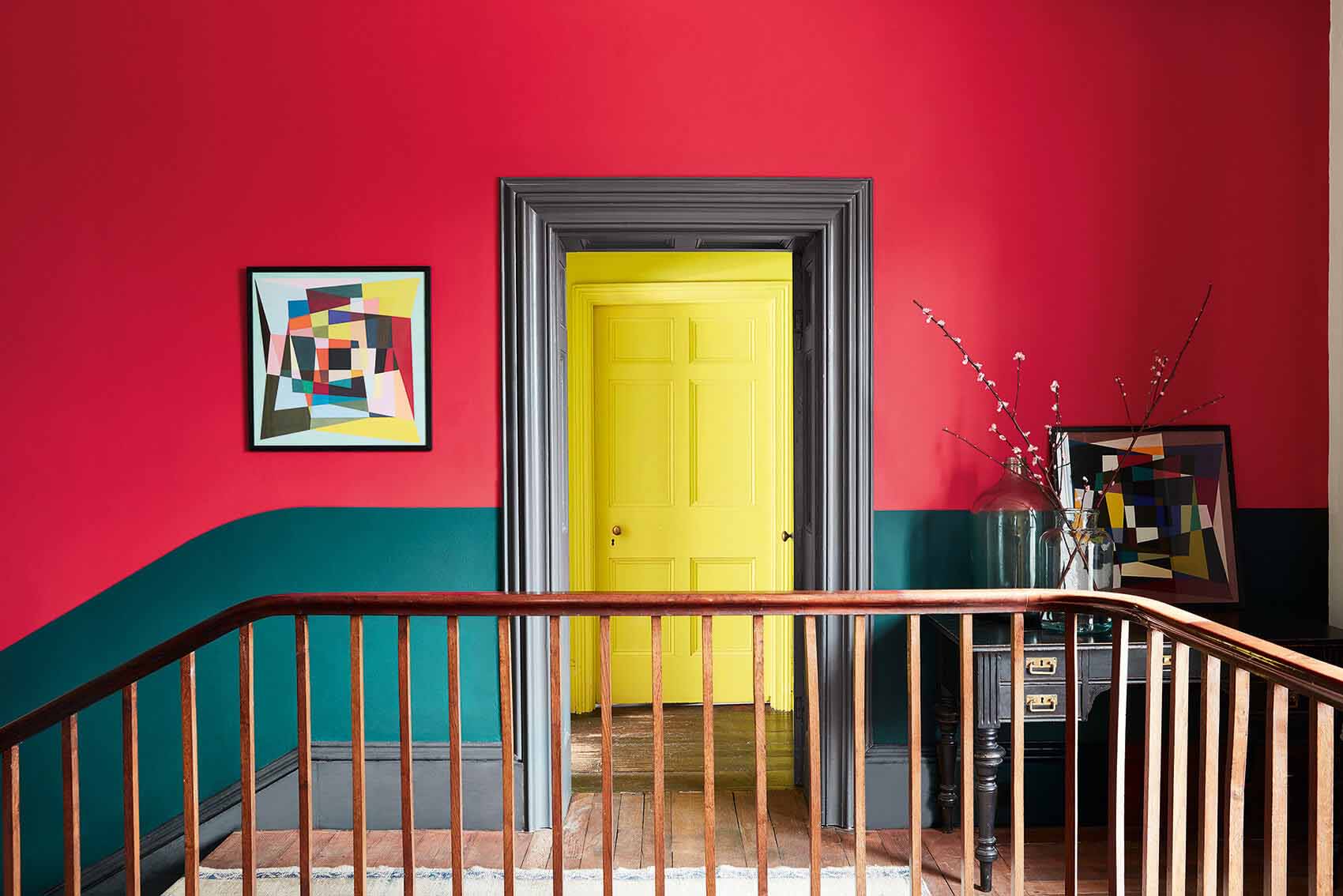
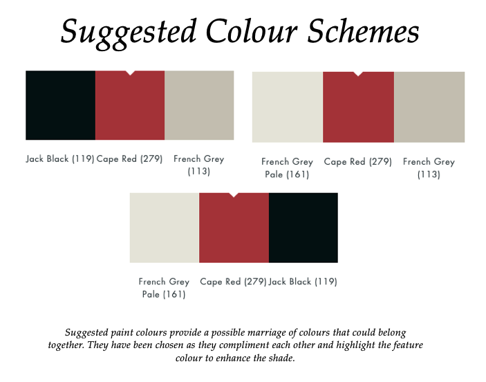
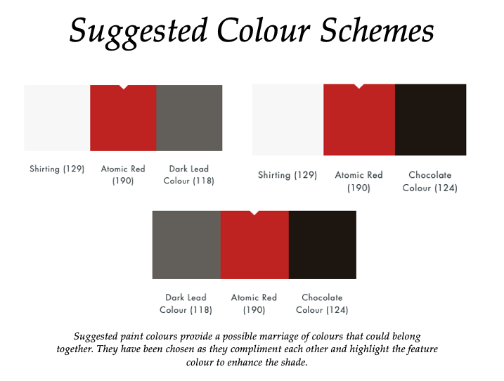
Little Greene’s reds include Cape Red (279) which is a fun, lively colour, Atomic Red (190) and Theatre Red (192), amongst many others.
For a statement look, use Cape Red (279) with Trumpet (196) and Mid Azure Green (96) (see main image above). For a softer, more muted colour scheme, it can be used with French Grey (113) as in the suggested colour scheme palette below.
Wallpaper
Our wallpaper collection includes designs by Emma J Shipley for Clarke & Clarke, Little Greene, Harlequin and Prestigious Textiles.
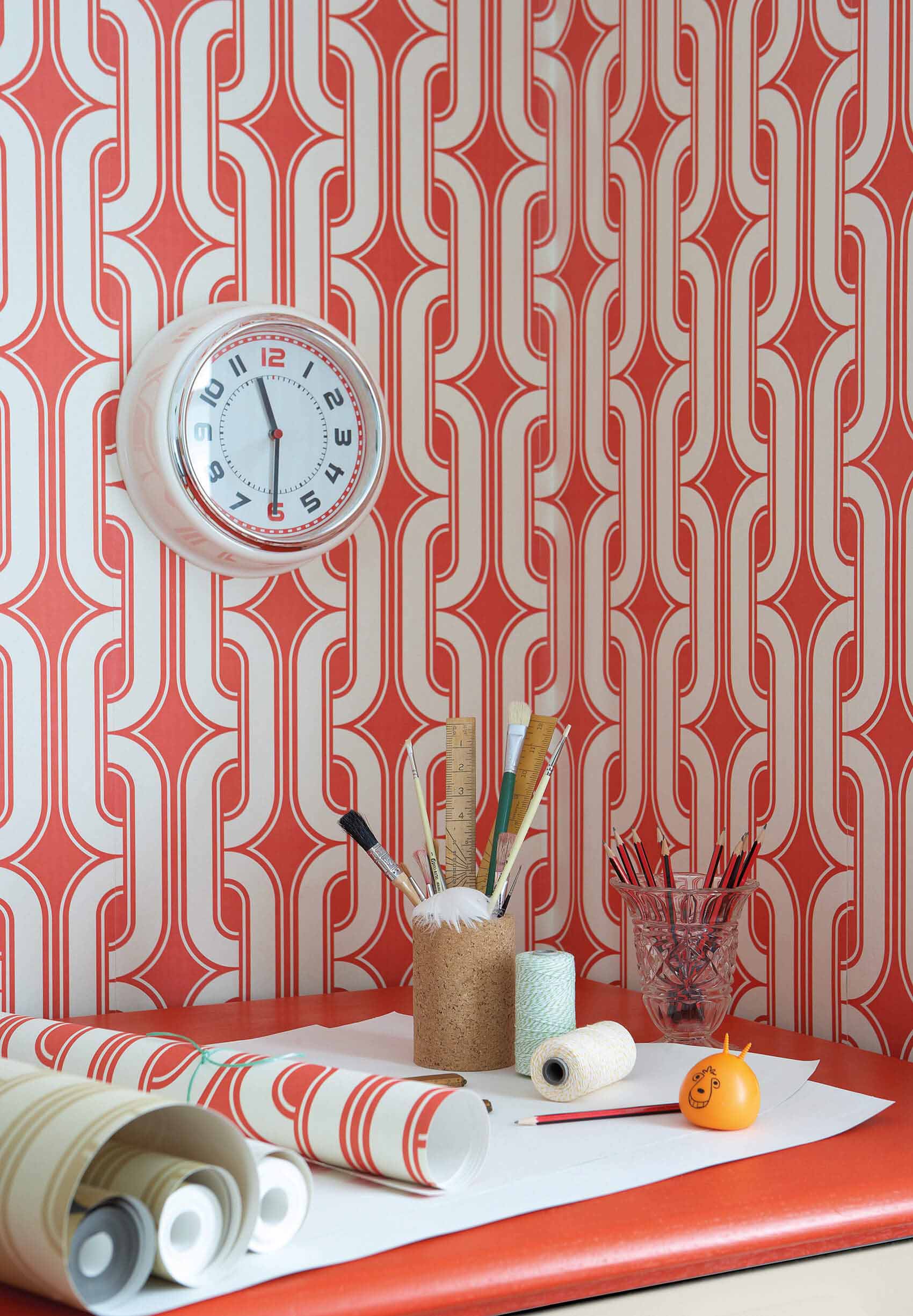
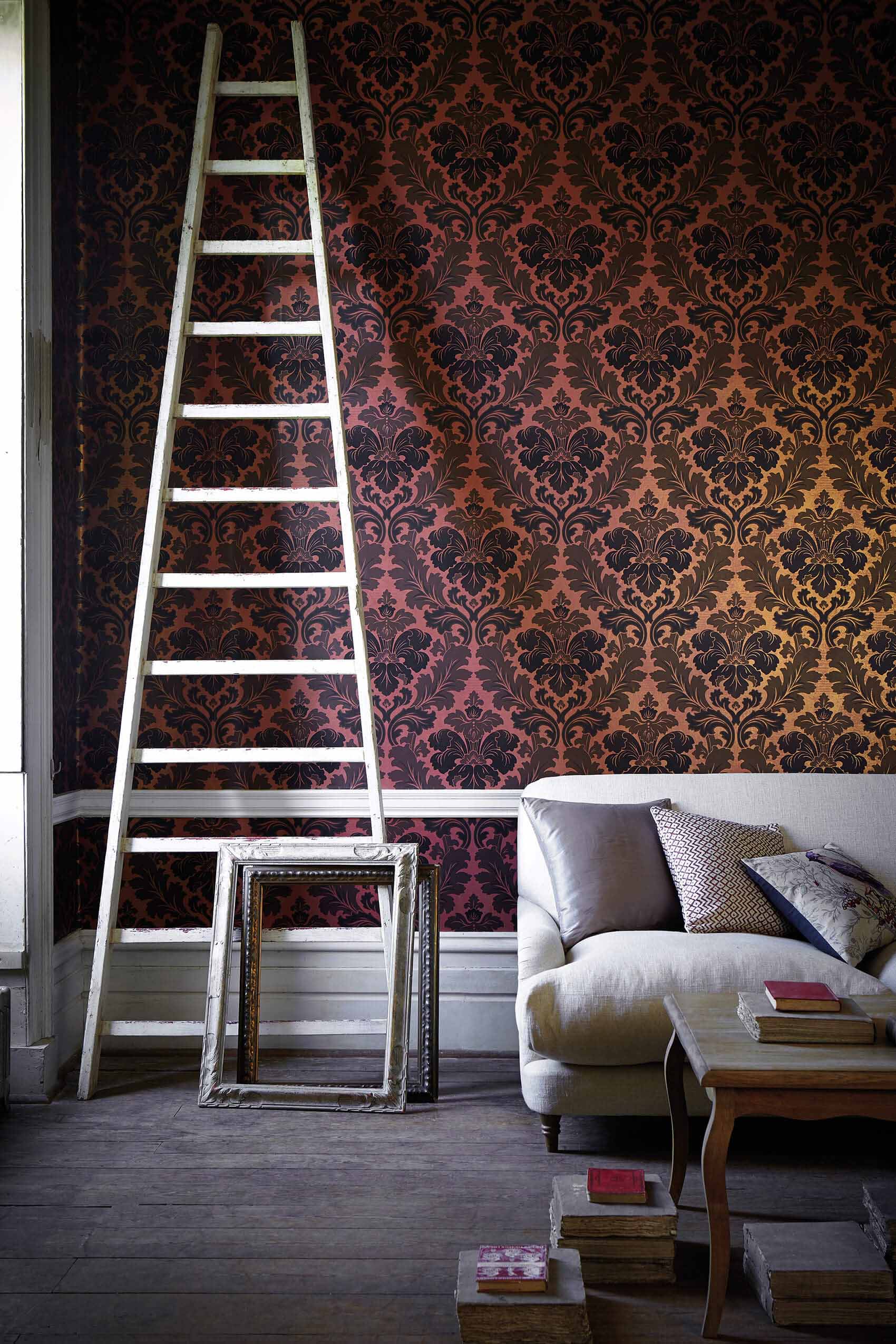
For a bold, statement design try Little Greene’s Lavaliers wallpaper in Atomic (image 1). This iconic design is part of their 20th Century collection and was known to have existed in the 1970’s, originally in neutral colour ways. The striking Atomic colour way enlivens and energises a room. Little Greene’s Bonaparte wallpaper in Red Gold (image 2) is from the 19th century collection. This paper is a revision of an authentic 19th Century French damask and was found more recently as a painted piece of artwork in a Parisian studio.
Curtains, Blinds and Fabrics
For the perfect window dressing, you can choose your fabric for our Made to Measure Roman Blinds or Curtains. We offer a wide variety of headings including a contemporary wave heading or a more traditional heading such as goblet, pencil pleat, triple or double pinch pleat.
You can also select fabric by the metre from a range of design houses. These include Sanderson, Scion, Anthropology, Harlequin, Morris & Co and Clarke & Clarke, amongst many others.
Finishing Touches
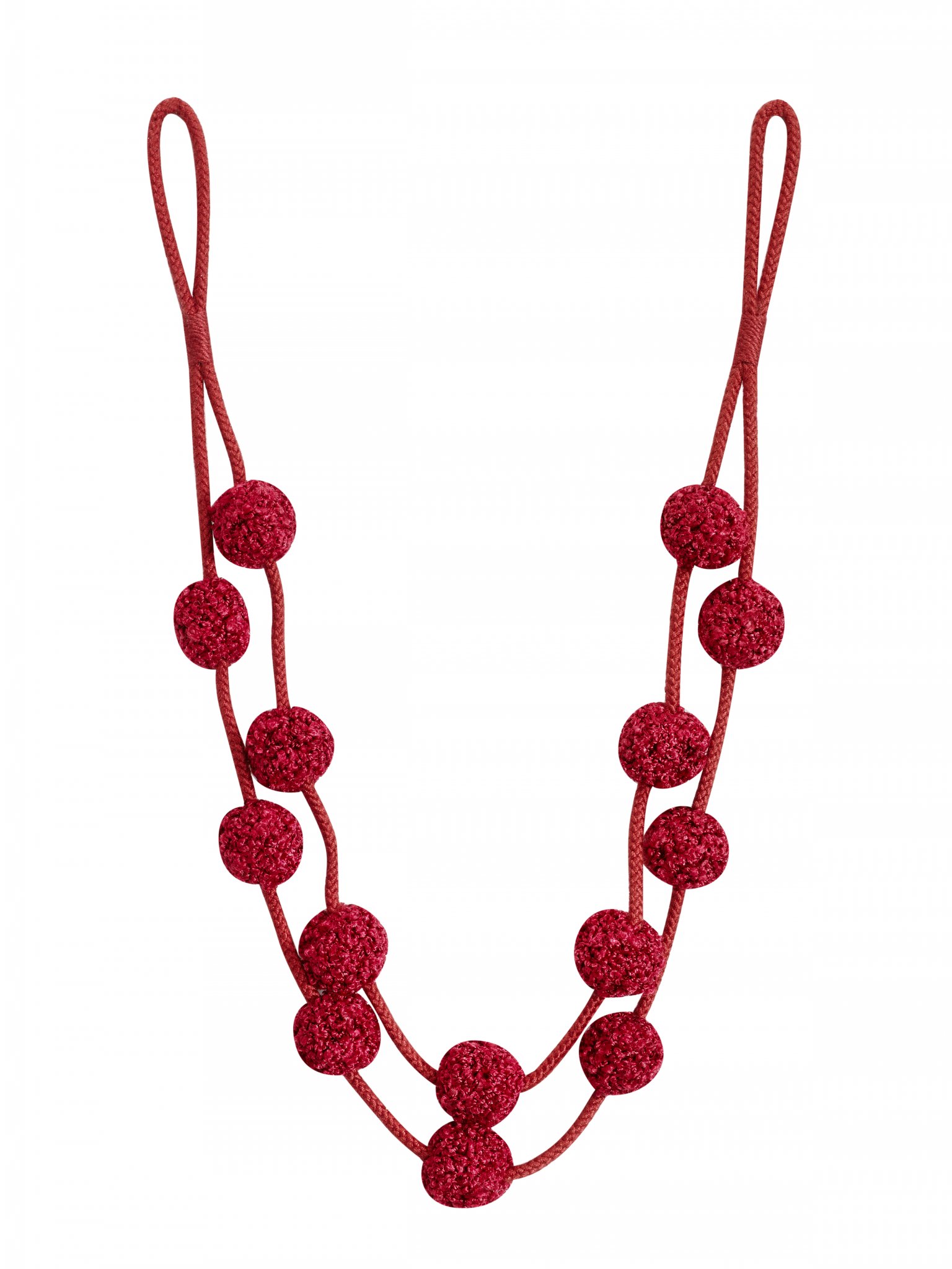
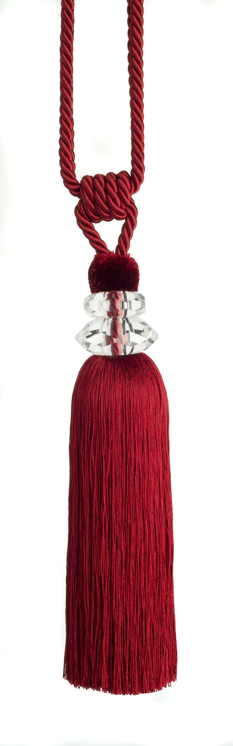
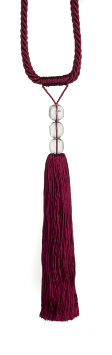
See our array of curtain poles and tracks to complement your window dressings. Enhance your window treatment further with the addition of beautiful decorative tiebacks for your curtains. The Hallis Rolls Opus Rope Tieback in Brick Red (Image 1), the Swish Excelsior Tieback in Red (Image 2) or the Swish Finesse Tieback in Red (image 3) are the perfect choice for a luxurious addition to your colour scheme.
With a vast array of traditional and more contemporary reds available, your choice will depend on the ambience you wish to create. You can add energy and excitement with the brighter tones of red or if you are aiming to create an atmosphere of warmth and cosiness, the more traditional deeper tones are the perfect choice.
Please contact us if you would like any advice on paint or fabric choices, swatches, pole ring samples or any other samples.
Email: sales@thehomeofinteriors.co.uk or give us a call on 01590 615775.